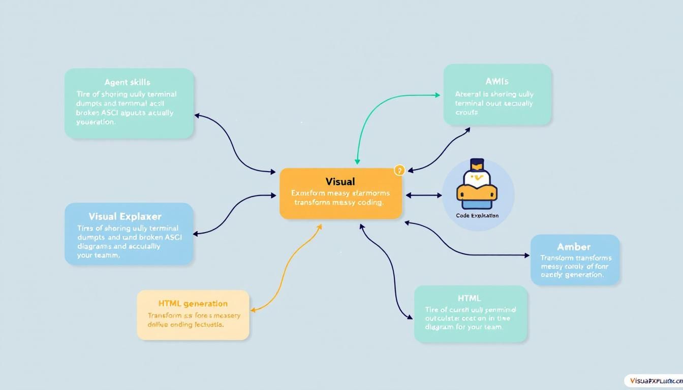
Visual Explainer: The Agent Skill That Makes Terminal Output Actually Shareable
Tired of sharing ugly terminal dumps and broken ASCII diagrams with your team? Visual Explainer transforms messy coding agent output into polished HTML pages with real typography, dark mode, and interactive diagrams that actually look professional.
agent skillscode visualizationterminal output formattingHTML generationarchitecture documentation
Your coding agent just generated a brilliant architecture analysis. The insights are solid, the recommendations are spot-on, but there's one problem: it looks like it was formatted by a dot-matrix printer from 1987.
Why Terminal Output Is Killing Your Documentation Game
We've all been there. You spend 20 minutes crafting the perfect prompt for Claude or GPT-4 to analyze your codebase architecture. The AI delivers exactly what you need — a comprehensive breakdown of dependencies, potential bottlenecks, and refactoring recommendations. Then you copy-paste it into Slack and watch your colleagues' eyes glaze over at the wall of monospace text.
The problem isn't the quality of AI analysis. Modern coding agents are genuinely brilliant at understanding complex systems. The problem is presentation. ASCII art diagrams break on mobile. Terminal tables lose their formatting in chat apps. Monospace dumps are about as inviting as reading assembly code.
The best insights in the world are worthless if nobody wants to read them.
This presentation gap is more than aesthetic — it's strategic. When your architecture reviews look like debugging logs, stakeholders tune out. When your code audits resemble error messages, teams skip the details. Professional presentation isn't vanity; it's communication effectiveness.
Enter Visual Explainer: HTML That Actually Works
Visual Explainer is an agent skill that solves the terminal output problem with surgical precision. Instead of asking your coding agent to "explain the architecture" and getting back formatted text, you ask for a "visual explanation" and get back a self-contained HTML page.
This isn't just syntax highlighting with extra steps. Visual Explainer generates:
- Real typography with proper headings, spacing, and readable fonts
- Dark mode support that doesn't strain eyes during late-night code reviews
- Interactive Mermaid diagrams with zoom, pan, and click-to-expand functionality
- Responsive layouts that work on phones, tablets, and ultrawide monitors
- Self-contained files with zero external dependencies
The workflow is dead simple. Instead of:
"Analyze the architecture of this React app and show me the component hierarchy"
You prompt:
"Generate a visual explainer for this React app's architecture with component hierarchy"
Out comes an HTML file you can actually share without embarrassment.
Visual Explainer transforms coding agents from terminal tools into presentation-ready analysts.
Three Game-Changing Use Cases
Architecture Overviews That Stakeholders Actually Read
Traditional architecture documentation lives in two extremes: either it's a massive Confluence page nobody updates, or it's a terminal dump nobody reads. Visual Explainer hits the sweet spot.
Ask your agent to "create a visual explainer for our microservices architecture" and get back an interactive diagram showing:
- Service dependencies with clickable connections
- Data flow patterns highlighted in different colors
- Scaling bottlenecks called out with warning indicators
- Technology stack broken down by service
The HTML output works perfectly in GitHub Pages, Notion, or any internal wiki. More importantly, it works in email — send the file as an attachment and recipients can open it in any browser.
Diff Reviews That Show Context, Not Just Changes
Code review fatigue is real. Staring at green and red lines in GitHub or GitLab interfaces tells you what changed, but not why it matters or how it fits the bigger picture.
Visual Explainer diff reviews include:
- Impact analysis showing which systems are affected
- Dependency changes visualized as before/after diagrams
- Risk assessment with clear callouts for breaking changes
- Testing recommendations based on the scope of modifications
Instead of commenting "LGTM" on a 47-file pull request, reviewers can actually understand the architectural implications.
Plan Audits That Connect Strategy to Implementation
Project planning tools like Linear, Jira, and Asana are great for tracking tasks but terrible at showing technical coherence. Visual Explainer bridges that gap.
Generate a plan audit that shows:
- Technical dependencies between seemingly unrelated tickets
- Resource allocation patterns that might cause bottlenecks
- Risk cascades where delays in one area affect multiple streams
- Integration points that need coordination between teams
The result looks like strategy consulting output, not project management busy work.
Visual Explainer makes the invisible architecture visible to everyone who needs to understand it.
The Technical Magic: Mermaid Diagrams That Actually Work
Here's where Visual Explainer gets genuinely clever. Most documentation tools treat diagrams as afterthoughts — static images that break when requirements change. Visual Explainer uses Mermaid.js to generate interactive diagrams that scale with complexity.
Mermaid diagrams in Visual Explainer include:
- Zoom and pan controls for exploring large architectures
- Clickable nodes that expand with additional detail
- Dynamic filtering to focus on specific subsystems
- Export options for presentations and external documentation
But the real magic is integration. The HTML page isn't just a diagram viewer — it's a complete analysis document where diagrams, text explanations, code snippets, and recommendations flow together seamlessly.
The self-contained nature means zero deployment hassles. No npm install, no Docker containers, no CDN dependencies. Just open the file in any browser and everything works.
Implementation Strategy: Start Small, Scale Smart
Getting started with Visual Explainer requires zero infrastructure changes. Here's the practical rollout:
Week 1: Personal Documentation
Start using Visual Explainer for your own architecture notes and code reviews. Get comfortable with the prompting patterns and HTML output quality.
Week 2: Team Sharing
Introduce Visual Explainer outputs in team meetings and code reviews. Let the presentation quality speak for itself.
Week 3: Stakeholder Communication
Use Visual Explainer for architecture presentations and project updates with non-technical stakeholders.
Month 2: Process Integration
Make Visual Explainer outputs standard for major architecture decisions and quarterly planning reviews.
The adoption curve is smooth because Visual Explainer doesn't replace existing tools — it makes their outputs more consumable.
The Bottom Line
Visual Explainer solves a problem that's been hiding in plain sight: AI coding agents are brilliant analysts, but terrible presenters. By transforming terminal output into professional HTML documentation, Visual Explainer makes AI insights actually actionable for teams and stakeholders. The days of sharing ugly ASCII diagrams and unformatted text dumps are over. Your architecture analysis deserves to look as smart as it actually is.
Try This Now
- 1Install Visual Explainer agent skill and test with a simple architecture overview prompt
- 2Convert your next code review comment into a Visual Explainer HTML report with Mermaid diagrams
- 3Generate a Visual Explainer plan audit for your current sprint and share with stakeholders
- 4Create a Visual Explainer template for recurring architecture documentation needs
How many Orkos does this deserve?
Rate this tutorial