The Google Gemini Infographic Hack That's Breaking LinkedIn Right Now
A viral LinkedIn creator just hit 480k impressions with hand-drawn style infographics made in seconds using Google Gemini. Here's the exact two-step process before everyone else catches on.
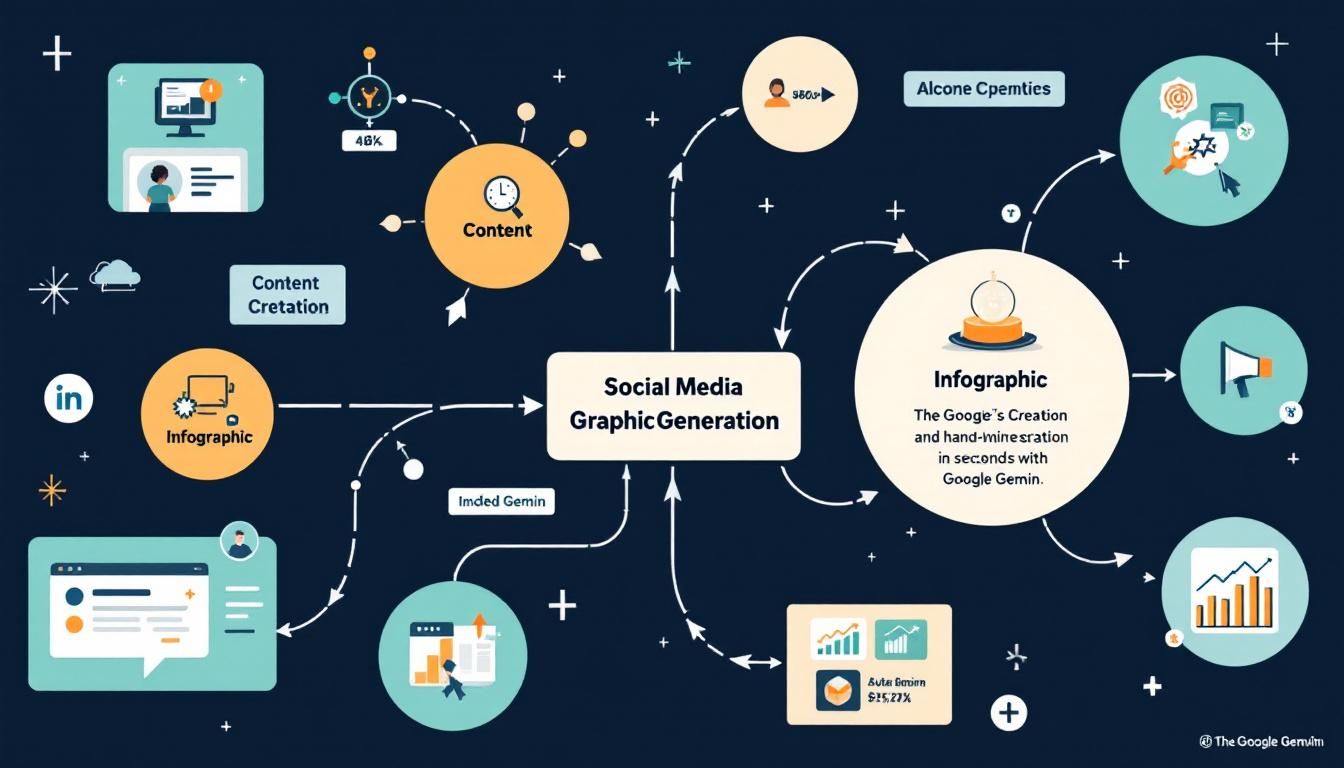
content creationsocial media marketinginfographic generationGoogle Gemini
Charlie Hill just cracked the LinkedIn algorithm with a simple trick that's generating hundreds of thousands of impressions. While everyone else is posting polished corporate graphics, he's going viral with infographics that look authentically hand-drawn — except they're made with AI in under five minutes.
Why This Matters
LinkedIn is having a moment. While other platforms fight for attention with flashy content, LinkedIn users are craving authenticity. The polished, corporate aesthetic that dominated the platform for years is getting steamrolled by content that feels real, personal, and human.
Google Gemini's latest capabilities have created a perfect storm for content creators who understand this shift. The AI can generate infographics that mimic the hand-drawn, sketch-like quality that stops thumbs mid-scroll — the kind of content that makes busy executives pause their endless LinkedIn feed.
The magic isn't in the perfection — it's in the imperfection that makes content feel authentically human.
Charlie Hill proved this formula works. His Gemini-generated infographics are pulling 480,000+ impressions because they look like someone spent hours sketching them by hand. Meanwhile, he's creating them in minutes with a two-step AI process that most LinkedIn users haven't discovered yet.
The Psychology Behind Hand-Drawn Content
Before diving into the technical how-to, it's worth understanding why this approach works so well on LinkedIn specifically.
Professional platforms like LinkedIn are flooded with three types of visual content:
- Stock photos that scream "generic corporate"
- Highly polished infographics that look like they came from a design agency
- Screenshots of data dashboards and spreadsheets
All of this content blends together into visual noise. But hand-drawn style graphics stand out because they trigger different psychological responses:
Authenticity perception: Our brains associate hand-drawn elements with personal effort and genuine thought Processing fluency: Slightly imperfect visuals actually increase engagement because they require a split-second more cognitive processing Trust signals: Content that looks "made by a human" builds more trust than obviously AI-generated material
The Scroll-Stop Factor
LinkedIn's algorithm rewards content that generates dwell time — how long users pause on your post. Hand-drawn style infographics create natural pause points because:
- They look different from typical LinkedIn content
- The sketch-like quality invites closer inspection
- Text within images forces users to slow down and read
This combination of visual novelty and forced reading time sends strong engagement signals to LinkedIn's algorithm.
Hand-drawn style content doesn't just get more views — it gets the right kind of views from people who actually stop and engage.
The Two-Step Gemini Process
Here's the exact process Charlie Hill used to generate his viral LinkedIn infographics. The key is using Google Gemini specifically — other AI tools don't produce the same hand-drawn aesthetic quality.
Step 1: Create Your Infographic Brief
Start with this prompt structure to generate a content brief:
Create a detailed infographic brief for [YOUR TOPIC]. Include:
- Main headline and key message
- 3-5 supporting points with specific data or insights
- Visual hierarchy suggestions
- Target audience considerations
- Call-to-action recommendation

Style: Professional but approachable, suitable for LinkedIn audience
Format: Hand-drawn sketch aesthetic
Replace [YOUR TOPIC] with your specific subject. For example:
- "remote work productivity tips"
- "B2B sales pipeline optimization"
- "startup funding strategies for 2024"
Gemini will output a structured brief that serves as the foundation for your visual content. Save this output — you'll need it for step two.
Step 2: Generate the Infographic
Take the brief from step one and use this prompt:
Using the brief below, create a hand-drawn style infographic layout:

[PASTE YOUR BRIEF FROM STEP 1]

Style requirements:
- Hand-drawn, sketch-like aesthetic
- Clean but imperfect lines
- Readable typography that looks handwritten
- Simple icons and illustrations
- Black and white or minimal color palette
- Professional but authentic feel

Output format: High-resolution image suitable for LinkedIn posting
Google Gemini will generate an infographic that hits that sweet spot between professional and hand-crafted. The AI's "nano banana" model (Gemini's internal designation for its image generation capabilities) specifically excels at this sketch-like aesthetic.
Pro Tips for Better Results
- Be specific about your topic: Generic topics produce generic results
- Test multiple variations: Generate 3-4 versions and pick the best one
- Check readability: Ensure text is clear when viewed on mobile devices
- Maintain brand consistency: Add your color scheme or logo if needed
The key to viral LinkedIn content isn't perfection — it's creating scroll-stopping authenticity that busy professionals can't ignore.
Why This Won't Last Forever
Every social media hack has a lifecycle. Right now, hand-drawn AI infographics work because:
- Novelty factor: Most LinkedIn users haven't seen this approach yet
- Low competition: Few creators are using Gemini for infographic generation
- Algorithm favorability: LinkedIn's current algorithm rewards engaging visual content
But here's what's going to happen:
- More creators will discover this technique
- The LinkedIn feed will get saturated with similar content
- The algorithm will adjust to the new content pattern
- Users will develop "banner blindness" to this format
The Early Adopter Advantage
Charlie Hill's 480,000 impressions didn't happen by accident. He was early to a trend that LinkedIn's algorithm currently favors. The creators who jump on this approach in the next few weeks will likely see the best results.
Timeline prediction:
- Weeks 1-4: High effectiveness as few people use this method
- Weeks 5-8: Moderate effectiveness as adoption increases
- Weeks 9+: Diminishing returns as format becomes common
The smart play is to use this technique now while testing other content approaches for when this trend peaks.
The Bottom Line
Google Gemini's hand-drawn infographic capability represents a perfect convergence of AI technology and human psychology. While polished corporate content continues to blend into LinkedIn's visual noise, sketch-like infographics are cutting through with authentic appeal that drives real engagement. Charlie Hill's 480,000 impressions prove this approach works — but only for creators who move fast enough to capitalize before the inevitable saturation. The two-step process is simple enough for any LinkedIn user to implement, but the window for maximum impact is closing with every creator who discovers this technique.
Try This Now
- 1Open Google Gemini and create your first infographic brief using the provided prompt template
- 2Generate 3-4 hand-drawn style infographics on topics relevant to your LinkedIn audience
- 3Post your first Gemini-generated infographic within the next 48 hours to test engagement
- 4Save Charlie Hill's LinkedIn profile to analyze his successful infographic formats
- 5Set a calendar reminder to track your infographic performance metrics after one week
How many Orkos does this deserve?
Rate this tutorial